Showing posts with label Artist: Frank McCarthy. Show all posts
Saturday, 16 May 2020
Marketing Guides: Thunderball and You Only Live Twice
Last December I compiled a marketing guide for "Thunderball" as a Christmas gift for my close collector friends. Things got a bit out of hand and I ended up with 118 pages to cover every country and item that I knew off. And now the Corona lockdown gave me the time to create the same for “You Only Live Twice”. Both are non-commercial projects for fun.
Sunday, 29 March 2020
Tribute to Frank McCarthy
Art tribute to Frank McCarthy's artwork for "Thunderball", painted by Peter Lorenz, gouache on artboard, 120 x 50 cm.
Saturday, 21 March 2020
Original Thunderball Frank McCarthy Artwork
Original painting by Frank McCarthy for "Thunderball", 60 x 90 cm, casein on illustration board
From The Nixdorf Collection
Sunday, 11 November 2018
Swiss Thunderball Posters
Swiss posters for "Feuerball / Operation Tonnerre" from 1965, 90 x 128 cm, Design by Werbeatelier Kipf. Produced for Unartisco S.A. Zürich. There are 3 variations: The German one, the French version and a smaller German version advertising the novel. The large posters are stamped on the back.
Thanks to the 007 Collector for sharing the information and pix!
Friday, 15 June 2018
Thunderball Artwork Tribute
Artwork tribute to Frank McCarthy's "Look Down" Thunderball painting. Gouache on art board, 90 x 60 cm.
Thursday, 3 May 2018
Frank McCarthy Art Tribute
1:1 Copy of Frank McCarthy's artwork for "Thunderball" Look Up / Jetpack. Gouache on artboard, 80x60 cm.
Sunday, 21 January 2018
The Other Thunderball “Look Down
American artist Frank McCarthy created the iconic “Look Down” artwork in 1965 for the film “Thunderball” But there is a lesser known alternative for this artwork which was used in the US 24 sheet and the French 8 panneaux.
Sketches for this artwork were recently unearthed by enthusiast Adrian Olivera.He recently came into the hobby through a stroke of luck, having acquired a collection of 1960's era MGM artwork. The collection consisted of pieces from films such as Where Eagles Dare, Ice Station Zebra, and Doctor Zhivago. Many artists were represented, including Howard Terpning, Frank Frazetta, Bob Peak, and Frank McCarthy. This find ignited his interest in movie artwork, and especially those of Frank McCarthy. His pursuit of more artwork led to the preliminary discovery.
These preliminaries provide a fascinating insight into the creative process:
McCarthy seems to have started with a much darker, bluer version of the artwork measuring 14" x 23", painted on artist vellum.This first version included much more details such as parachutes
and an airplane seen through the water.
A note on the back – presumably feedback from the art director (Donald Smolen?) – gives change instructions including “lighter water“.
Consequently McCarthy created a second version of the painting. The sketches were done on semi-transparent artist vellum, which gives an interesting insight into his work style: The back reveals that he first blotted out the broad composition with bold colours and then painted the details.
The resulting artwork is very detailed and highly dynamic with a lot of depth.
This pure version was rarely used. The only example I’m aware of is the Milton Bradley Thunderball game.
The published artwork is actually combination of the two artworks – Connery fighting the diver from the regular “Look Down” and this artwork. More details about this in this previous post:
http://illustrated007.blogspot.co.uk/2011/05/split-artwork.html
Thanks and credits to Thomas from the Nixdorf Collection and Adrian for sharing this!
To view more McCarthy drafts, please visit the following links:
Frank McCarthy Movie Poster Drafts
Frank McCarthy Round 2!
Sketches for this artwork were recently unearthed by enthusiast Adrian Olivera.He recently came into the hobby through a stroke of luck, having acquired a collection of 1960's era MGM artwork. The collection consisted of pieces from films such as Where Eagles Dare, Ice Station Zebra, and Doctor Zhivago. Many artists were represented, including Howard Terpning, Frank Frazetta, Bob Peak, and Frank McCarthy. This find ignited his interest in movie artwork, and especially those of Frank McCarthy. His pursuit of more artwork led to the preliminary discovery.
These preliminaries provide a fascinating insight into the creative process:
McCarthy seems to have started with a much darker, bluer version of the artwork measuring 14" x 23", painted on artist vellum.This first version included much more details such as parachutes
and an airplane seen through the water.
A note on the back – presumably feedback from the art director (Donald Smolen?) – gives change instructions including “lighter water“.
Consequently McCarthy created a second version of the painting. The sketches were done on semi-transparent artist vellum, which gives an interesting insight into his work style: The back reveals that he first blotted out the broad composition with bold colours and then painted the details.
The resulting artwork is very detailed and highly dynamic with a lot of depth.
This pure version was rarely used. The only example I’m aware of is the Milton Bradley Thunderball game.
The published artwork is actually combination of the two artworks – Connery fighting the diver from the regular “Look Down” and this artwork. More details about this in this previous post:
http://illustrated007.blogspot.co.uk/2011/05/split-artwork.html
Thanks and credits to Thomas from the Nixdorf Collection and Adrian for sharing this!
To view more McCarthy drafts, please visit the following links:
Frank McCarthy Movie Poster Drafts
Frank McCarthy Round 2!
Saturday, 18 February 2017
Interview with artist Paul Mann
Artist Paul Mann kindly gave me an interview about his work and recent commission.Q: What inspired you to become an artist?
Answer Paul Mann:I feel I was born with the desire to be an artist. As a small child I was always drawing and very much encouraged by my family. As I grew that desire in me grew. My family and friends gave me such positive support and praise that I knew this was my calling in life.
Q: You mention on FB that you collect art yourself. What fascinates you about pop culture art?
Answer PM: As a young child I remember seeing Frank McCarthy's Thunderball movie poster. The poster showing the underwater attack scene with Bond in his orange wet suit struggling with another diver. That image inspired me and I knew that someday that would be the type of art I wanted to do. Throughout my life I have collected some of the original artwork of my favorite artists, of the fifties and sixties. I love the images of rugged men and beautiful women. Two of my favorite artists are Robert McGinnis and Frank McCarthy who also painted the early Bond posters. That era fascinates me because of the quality of artists and the work they were able to produce. Unfortunately it is becoming a lost art. There are very few artists around that can produce such work.
Q: What is your preferred painting medium?
Answer PM: I work in oils, gouache, and acrylic, I'm comfortable with all three mediums but my favorite would be gouache and acrylic. There is no wait time for the paint to set up as with oil because of that I can paint very fast with them and control the paint which gives me the results I want.You recently completed a commission for a McCarthy-style “On Her Majesty’s Secret Service” artwork, please tell us about that.
Q: How do you interpret the briefing and communicate your ideas to the client?
Answer PM: The client had a pretty good idea of what he wanted the art to consist of, I did my best to put together on paper what the client is seeing in his head. I sent the client images of my sketches. The client then communicated back to me if there were things to change or move. Such as angles, colors, and so forth. I then incorporated those ideas back into my sketch until we had figured it all out. Again these illustrations are not easy to put together and it can take some time to come up with a good sketch that works.
Q: What is your process?
Answer PM: I always start with some simple doodles to get a basic design working and the placement of people and objects.
Next I will call in models and do a photo session, with those photos and any other scrap I have I will put together a simple but accurate line drawing. Sometimes I may have to draw this out several times before I can get everything to fit nicely and work as a design. Once the client okay's the sketch I go to a full color comp. This is where I want to make sure everything is working, that everything is sized right and that the color comes together. I do take time to do a nice and finished color rough.
Once okayed by the client I go to the finished art which will be much larger than my colored sketch. I grid off the board I will be painting on and also my color sketch so I can make sure all objects will line up exactly the same on my final painting board as they did on my color sketch. My finished art is usually done on illustration board or Masonite panel. Using my color rough as a reference I will start blocking the larger color masses in. Knocking in the background color first and working from background to foreground. I will begin painting in all objects one by one, people, cars, helicopters, buildings until it all comes together.Q: The artwork features a lot of different elements. What do you use as a reference?
Answer PM: That's always a challenge; first I look at all photos that I can find on the internet from the movie. I do this to see if there is anything I can use as a good reference. Usually there is very little I feel that will work for me. I have to have the best reference material I can find or photograph my own figure scrap.
I will bring into the studio models in costumes to pose and photograph. It might be someone in a dark suit I will photograph him in the position that I need and then add the real Bond's head onto the body or my model will be wearing a military style outfit that is close to what was worn in the movie. This may mean a trip to the army surplus to find costuming. I will hand my model a toy machine gun that I spray painted black to make it look authentic.
I then have him stand on a large sheet of plywood with one end elevated about two feet off the ground so he is standing on a slanted surface. It’s a lot of work which the client is not aware of but it does give me the material I need to do the art.
Q: Did the artwork change while you were painting it?
Answer PM: Yes, I was not happy with the Bond head I had, so I changed to a different head which worked much better. You can let some things slide a little bit but never on a head. It has to be right on and look like the character. The client also had one change he wanted a little surprise in it. If you look close in the upper windows of the Piz Gloria you will see it.
Q: What are the finishing touches for the artwork?
Answer PM:The client asked me to add more fighting figures in the painting and to have snow blowing up from under the helicopter. Adding the blowing snow worried me a little because if I over did it my people at the bottom of the art would disappear. I tried to add enough to make the client happy but not too much that I lost the figures. The snow was a good call on my client’s part it helped Bond pop out more.
Big thanks to Paul for his interview and Thomas from the Nixdorf Collection for sharing the commissioned artwork!
Wednesday, 30 December 2015
Original Look Up Artwork by McCarthy
Sunday, 29 June 2014
German Little Nellie Poster
German A1 poster for "Man Lebt Nur Zweimal" (You Only Live Twice). For whatever curious reason the Little Nellie artwork by Frank McCarthy was altered: Helicopters in the background removed, Little Nellie is red and the rockets are black. US 1 sheet with original artwork for comparison on the right.
Friday, 17 January 2014
US Thunderball Posters
Overview of US "Thunderball" posters (that I know of): From the different 1 sheet posters up to the 24 sheet. Corrections and additions welcome!
Sunday, 17 November 2013
You Only Live Twice UK Hanging Card
Hanging Card for "You Only Live Twice", UK, 13 x 8 inches. This is featured in the UK Exhibitors Campaign Book but I've never seen it in real life. Does this really exist?
Saturday, 9 November 2013
24 Sheet from You Only Live Twice
Recreation of the planned 24 sheet for "You Only Live Twice" as shown in the pressbook. The concept still uses the unchanged versions of McGinnis' bath scene (check his hand) and McCarthy's original Little Nellie painting with an alternate face of Connery.
Tuesday, 14 May 2013
On Her Majesty's Secret Service - European Posters
European posters for "On Her Majesty's Secret Service".
Are there other OHMSS posters out there that I missed? Finland? Turkey? Curious to find more. Thanks!
Monday, 13 May 2013
On Her Majesty's Secret Service - International Posters
On Her Majesty's Secret Service - English Language Posters
I've anticipated this moment for a while: I'm running out of art to show in this blog. So I've decided to publish my collection of (digital) posters for each movie, sorted by countries.
"On Her Majesty's Secret Service" makes the start with English language posters, more to follow. Please let me know if something is missing or not correct.
Monday, 6 May 2013
Look Up and Down
My art tribute to Thunderball inspired by both "Look up" and "Look Down" artwork by Frank McCarthy. Gouache on artboard, 80x60 cm.
Saturday, 27 April 2013
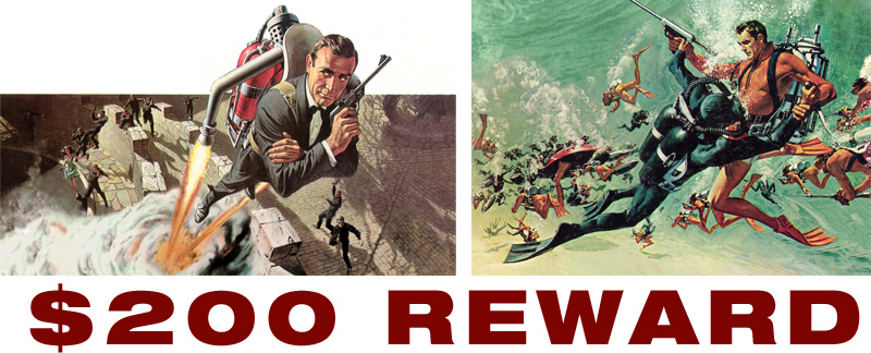
Looking for Thunderball Artwork Scans
I've been looking for ages for good quality scans of the transparencies (oversized slides used for printing) of the Look Up / Down Thunderball artworks by Frank McCarthy. If you own them and like to share a high resolution scan with me, I'm offering a reward of $200. If needed I'll pay the scanning costs separately. Please email me using my contact info on the top right of this blog. Thanks! Peter
Saturday, 10 November 2012
James Bond Poster & Photo Exhibition Catalogue
Pages from the exhibition catalogue "Bond,... James Bond - Filmplakate und Fotografien aus fuenfzig Jahren".
The catalogue is filled with new and unseen artwork (at least for me) from McGinnis, Peak and many others. There are also rare posters from all over the world from the collection of Thomas Nixdorf collection and rare photos from the collection of Robert Ganz. Catalogue is available here.
Friday, 30 September 2011
Thunderball Art Tribute

I've set myself the goal to reproduce all Thunderball artworks using the same materials, colours and (almost) the same formats. Just finished the Thunderball "Look Down" artwork based on Frank McCarthy's original. Sadly my digital camera does not capture the details too well, scan shows the face a bit better. Below a work-in-progress version without the air bubbles and the diver still as a sketch. Frank McCarthy's original for comparison below
.
Subscribe to:
Posts (Atom)