Cover artwork for James Bond paperback novels from Thailand, published in 1964 / 1965.
Friday, 14 December 2018
Sunday, 25 November 2018
Sunday, 18 November 2018
Italian Dr No Reissue Artwork
"Dr No", reissue artwork by Italian artist Enzo Sciotti, 49x34cm. Below details of the artwork and the artist (r) with Thomas from the Nixdorf Collection (l).
Sunday, 11 November 2018
Swiss Thunderball Posters
Swiss posters for "Feuerball / Operation Tonnerre" from 1965, 90 x 128 cm, Design by Werbeatelier Kipf. Produced for Unartisco S.A. Zürich. There are 3 variations: The German one, the French version and a smaller German version advertising the novel. The large posters are stamped on the back.
Thanks to the 007 Collector for sharing the information and pix!
Thanks to the 007 Collector for sharing the information and pix!
Wednesday, 7 November 2018
Swiss Re-Release Posters
Monday, 22 October 2018
Diamonds Are Forever Folio Edition
2018 Edition of Ian Fleming's "Diamonds Are Forever" published by the Folio Society with illustrations by Fay Dalton.
Italian Fleming Paperbacks
Italian paperbacks published by I Romanzi del Corriere in the 50s.
Thanks to Giovanni for sharing these!
- La Benda Nera (Casino Royale)
- Per i Tuoi Occhi (For Your Eyes Only)
- L'Impronda del Drago (Doctor No)
Thanks to Giovanni for sharing these!
Wednesday, 10 October 2018
Comics Royale
A new website for English language translations of foreign comics has been launched: Comics Royale. So much interesting artwork...
Sunday, 2 September 2018
James Bond Books from Thailand
James Bond books from Thailand, published in 1964: Casino Royale, Thunderball and You Only Live Twice, Ian Fleming.
Sunday, 12 August 2018
James Bond Origin Comics
Cover artwork by Kev Walker for the upcoming "James Bond Origin" comics by Dynamite. More covers by other artists below.
Wednesday, 8 August 2018
Interview with Tony Seiniger
Tony Seiniger had a long and distinguished career in advertising starting film advertising in New York while working for a television commercial production company and eventually his own film advertising agency called Seiniger Advertising in Los Angeles.
Q: How were you involved in the James Bond marketing campaigns / who approached you?
TS: I was approached by the advertising executives at United Artists based in New York. Even though I was based in California, they said that they were looking for "new blood" to work on the upcoming Bond movie "Moonraker." I found out later why they were looking for new blood.

Q: After the success of "Star Wars" (1977) the Bond producers decided to continue with a space themed 007 movie. What was the challenge?
TS: The challenge was very simple. United Artists flew me to Paris to meet with Cubby Broccoli, the film's producer. We had a very brief meeting at the Boulogne Studios. Mr. Broccoli told me that he had been very dissatisfied with the poster art done for the previous Bond film, "The Spy Who Loved Me." He said, "Roger didn't look like Roger." He went on to tell me that he didn't care what idea I came up with, that he didn't care about the concept, only that "Roger should look like Roger."
With Mr. Broccoli's concerns in mind, I knew that a good photography session had to occur. I went back to Paris, and I worked with the unit stills photographer, David James. We spent most of a day photographing Roger Moore, in a variety of poses, one of which was the down angle that would be needed to successfully illustrate the "Bond as a rocket" concept that became the US teaser poster. Mr. Moore was extremely cordial and cooperative, as long as we kept him amply supplied with No.1 Special Montecristo cigars.

Q: Why was Dan Goozeé chosen as illustrator?
TS: Dan was selected as the illustrator because of his commitment to detail, and his sense of responsibility. Many illustrators back then were very flaky, especially when it came to deadlines. Dan was always someone I could count upon. In today's digital world, I would not have used an illustrator. With the quality of photography I had from the photo session in Paris, I could have executed the "rocket" concept in Photoshop, utilizing a stock NASA photograph of Earth. But this was 1979, long before Photoshop. I did not assign any other illustrators, but since every distribution territory had the right to execute their own versions of the main campaign art, there were many other illustrators involved in "Moonraker" on a world-wide basis.
Q: Dan Goozeé painted the two advance poster artworks and the final finished 1-Sheet art. Who was the illustrator of the design showing space paddles with action scenes ?
TS: I believe this art was executed by one of the "foreign' territories, not United Artists in the US.

Q: When you heard the title "Octopussy" for the first time what were your thoughts?
TS: I had not read any of the Ian Fleming books, so I knew nothing about "Octopussy." It wasn't until I read the script that I realized Octopussy was the name of the lead female character.
 Q: Who came up with the brilliant idea of showing Octopussy inspired by indian goddess Durga-Shakti with 8 arms ?
TS: The idea was obvious to me. "Octo" meaning eight. "Pussy" referring to Maude Adams. So Maude Adams with eight arms. I was not inspired by the Indian goddess at all.

Q: Any recollections why this illustration was not widely used ?
TS: I had nothing to do with this piece. But if you look at the figure of Bond, it's clearly taken from the key art for "Live and Let Die." the first Roger Moore Bond film. It may have been an early teaser poster concept executed by an agency in New York.
Q: The teaser design also is very clever showing Octopussy from behind and 13 times James Bond. Along with a great tagline. Who came up with this idea to hide the identity of Octopussy?
 TS: My idea was to convey that "Octopussy" was the 13th Bond film. Since Maude Adams was NOT a movie star, the emphasis had to be on Bond, not her.
Q: A View To A Kill has a very innovative poster campaign. Who came up with this great idea?
TS: Again, the concepts for all these Bond posters came out of my head, for better or for worse. Grace Jones had collaborated with a brilliant photographer/graphic designer named Jean-Paul Goude. Together they created striking images of Grace; distorted and exaggerated, but beautiful at the same time. These images were my inspiration for how Grace should be portrayed on the back-to-back poster. Her legs are extended way beyond normal human proportions. And so were Roger's. He had to be a bit taller than Grace.

Q: The movie was Roger Moore's last Bond. Did you know that when preparing the campaign and if yes did it have an impact ?
TS: We all knew this was going to be Roger's last Bond film. He was nearing 60 years old, a bit old to play Bond, but the Broccolis did not have a ready replacement. They always wanted Pierce Brosnan, but he was tied up with a very lengthy commitment to the TV series "Remington Steele." That's how Timothy Dalton got his two Bond films. The Broccolis had to wait almost ten years for Pierce to be free to play Bond.
Q: Dan Goozeé was again responsible for the posters. Focus was on perspective & location with the Eiffel Tower and the Gold Gate Bridge. Any anecdotes as for the developments of these?
TS: We had developed a "forced perspective" look with the "Moonraker" teaser poster. There was a very conscious decision on my part to revisit that look for "A View to a Kill." We decided to push this concept as far as we could. The Paris and San Francisco locations are in the film, but never as we portrayed them. We just took it to the limit. After all, James Bond was a cartoon character. At least until the Timothy Dalton films. And Daniel Craig has done even more to dispel the cartoon image.

Q: Any involvements in the “white tuxedo” style which is also pictured in my book or was it done for UK & Japanese markets only ? Note: painted by Brian Bysouth based on a design by Vic Fair.
TS: I had nothing to do with this poster. But remember, the individual territories (countries) releasing these films had the right to create posters that they felt would best appeal to their market.

Thanks to Thomas from the Nixdorf Collection for sharing this interview! He interviewed Tony in 2012.
Tuesday, 7 August 2018
James Bond Tribute Artworks
James Bond tribute artworks by Adrian Keindorf, Gouache.
Thanks to Darren and Adrian for sharing these.
Thanks to Darren and Adrian for sharing these.
Thursday, 19 July 2018
Look Down Art Tribute
Tribute to Robert McGinnis' illustration for the "Thunderball" Look Down artwork. 78x54cm, gouache on artboard by Peter Lorenz
Wednesday, 18 July 2018
Tuesday, 19 June 2018
Diamonds Are Forever Concept Artwork
Concept artwork, signed by Robert McGinnis for "Diamonds Are Forever", gouache and mixed media on board, 96 x 62 cm. Currently up for auction at Bonhams.
Friday, 15 June 2018
Thunderball Artwork Tribute
Artwork tribute to Frank McCarthy's "Look Down" Thunderball painting. Gouache on art board, 90 x 60 cm.
Sunday, 10 June 2018
Forever and a Day
Proof edition and Waterstones special first edition of Anthony Horowitz' James Bond continuation novel "Forever and a Day", published by Jonathan Cape 2018. The poof - kindly shared by Ian Fleming Publications - differs from the release version as shown below. Proof on the left, release edition on the right.Big thanks to Alan for making this possible.
Saturday, 26 May 2018
The New Data Law
Dear Readers, the new EU data law has come into effect and as a result I have disabled comments, which I find really sad. At present it is not clear how to deal with this situation, wait and see. But I don't want any trigger happy lawyer to try to make money off this situation. You can reach me via my usual email if you want to get in touch.
If anyone knows more about the comment situation and if it conflicts with the new law, pleasecomment email me. Love to turn the comment function back on.
If anyone knows more about the comment situation and if it conflicts with the new law, please
Monday, 21 May 2018
James Bond Comics - The Body
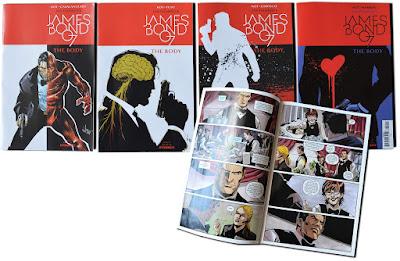
First 4 parts of the 2018 Dynamite comic series "The Body" by writer Ales Kot. Cover illustrations by Luca Casalanguida,
James Bond Books Guide Project
Have a look at the recently started James Bond Books Guide project by Gleb Belyaev. More information here.
Thursday, 3 May 2018
Frank McCarthy Art Tribute
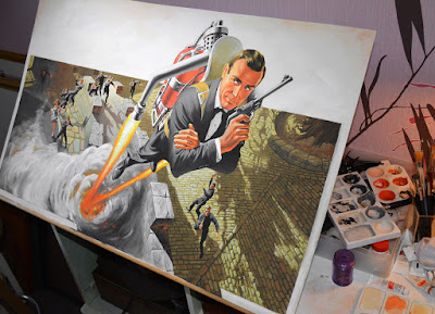
1:1 Copy of Frank McCarthy's artwork for "Thunderball" Look Up / Jetpack. Gouache on artboard, 80x60 cm.
Subscribe to:
Posts (Atom)


